Boarding Pass Design
School Project - Wilfrid Laurier University
2025
Project Case Study
Overview
This assignment was simply to design a paper boarding pass for a fictional new airline company (Air Canada Awesome!). This pass would need to include all relevant details one would typically find on such a document. To push the design further, I gathered and employed user data to ensure that the design would truly address a user's information needs. The final design is extremely informative and i organized into easy-to-read groups.
Process
Card Sorting
To begin I created a card sort to see what information users saw as important on their passes. In this case the users I will initially focus on are ticket holders rather than airport employees. In our assignment there were some mandatory inclusions:
Barcode or QR code
Boarding gate number
Boarding group number
Boarding time
Date and Departure time
Destination and code
Flight Number
Last Name and First Name of passenger
Origin and code Seat number
These were all turned into cards. After looking at existing boarding passes and considering my own information needs I added some cards of my own:
Airplane model
Airplane carrier name
Cabin
"Gate closes 15 mins prior to departure"
Boarding pass label
Airline use/Sequence number (sequence of check-in, for internal airline use)
E-ticket number
Ticket type (ie. economy, business, etc)
Airport address
The goal of the boarding pass is to include all of this information but make what's important to the user be the most simple to parse at a glance.
Analysis
Here is a table of my final results:
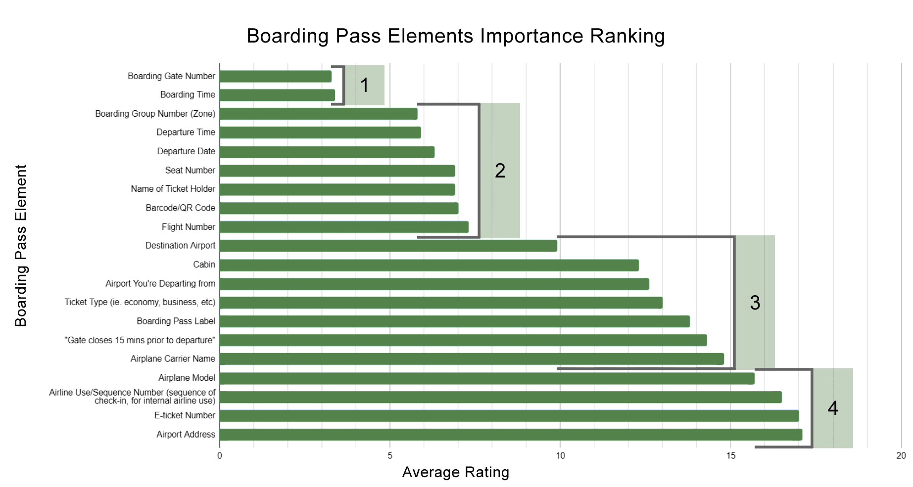
I divided the results into 4 regions where the overall ranking was beginning to be quite similar. These regions will help to provide a hierarchy to the design. The research yielded 2 elements that were unanimously ranked as the most important details:
Boarding Gate Number
Boarding Time
Second in our hierarchy would be the details that almost evened out to second most important. This includes:
Boarding Group Number (Zone)
Departure Time
Departure Date
Seat Number
Name of Ticket Holder
Barcode/QR Code
Flight Number
The details that could be considered relevant but not very important to the user include:
Destination Airport
Cabin
Airport You're Departing from
Ticket Type (ie. economy, business, etc)
Boarding Pass Label
"Gate closes 15 mins prior to departure"
Airplane Carrier Name
And finally, the irrelevant details were:
Airplane Model
Airline Use/Sequence Number (sequence of check-in, for internal airline use)
E-ticket Number
Airport Address
Design
For the physical boarding pass, I created a completely black-and-white design to ensure high readability and low print costs. The different elements of the boarding pass are assigned different levels of importance through the use of font size and type. The elements that needed to be highlighted were decided based on the survey to ensure that the design of the boarding pass would cater to the users, specifically the passengers. All info needed by the airline employees (the secondary users) was grouped to the side as many survey responses found them to be the least important. After the rankings of all respondents were averaged, clear groups emerged in the data. These elements were assigned similar levels of importance that can be seen in the pass’s design.
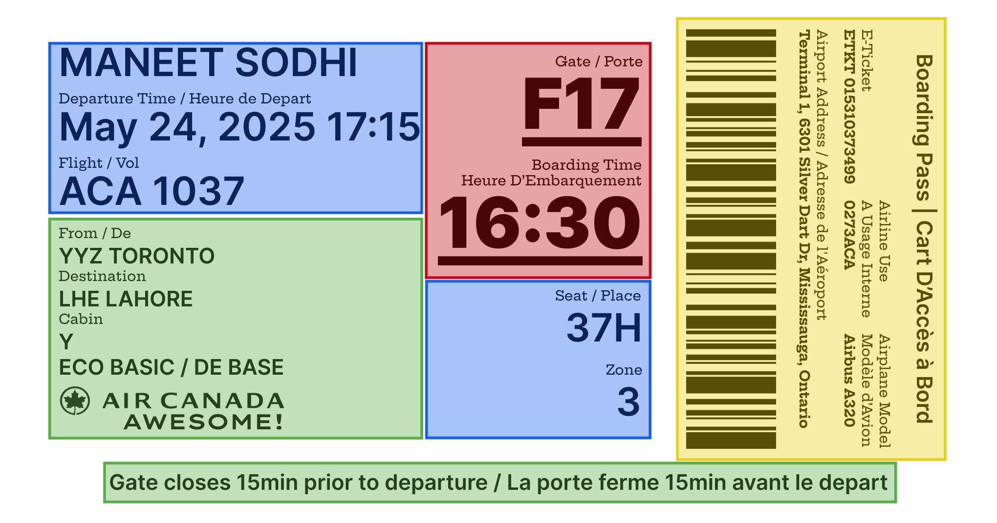
Additionally, the labels are written in both English and French for increased accessibility. I also decided that the name on the boarding pass should be “first name” and then “last name” as this would decrease the words needed to be read/skipped over before the main differentiator is read, especially for passengers flying as families.
Conclusion
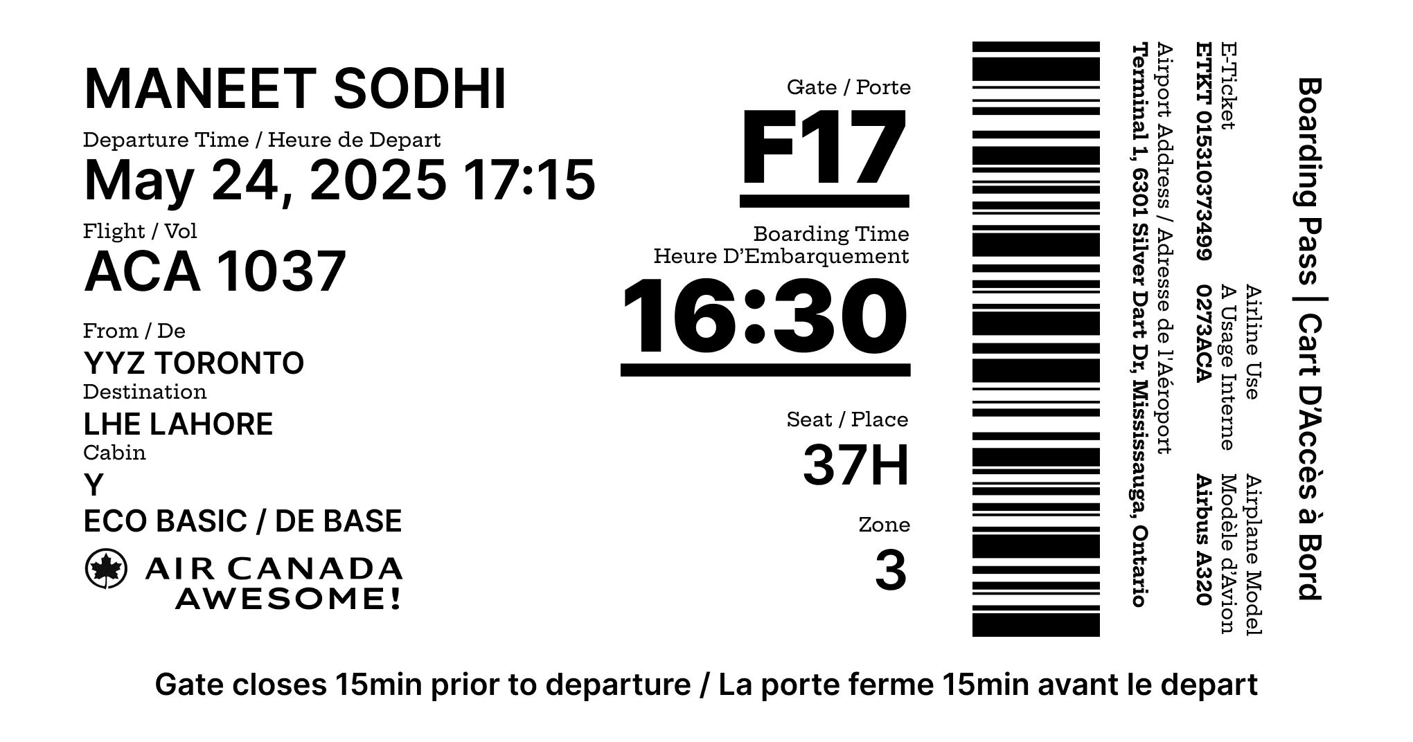
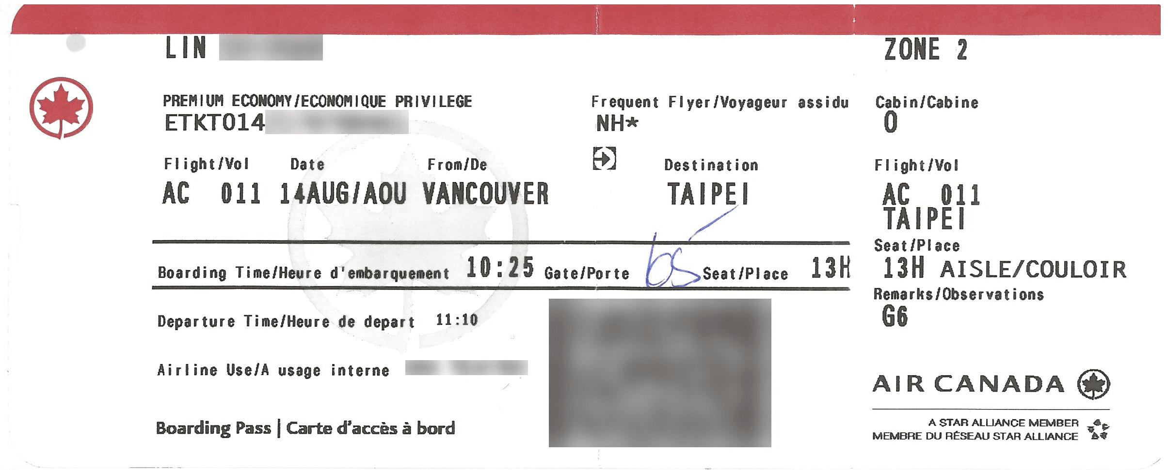
Example of an existing paper boarding pass design:
My design:

Overall, the findability of important information has been improved and user's information needs have been met.