GRCOA Website Rework
A forward-looking redesign of the GRCOA's website to ensure that, in 20 years, the website will continue to support the evolving information needs of its users.
Project Case Study
GRCOA (Grand River Council on Aging)
7 months (2025-2026)

The Problem
Our client faced an enormous threat to their website's success. As an organization that targeted a specific age group, they needed to be able to prepare themselves for the eventual change in their user's behaviours and needs. My team was tasked with envisioning a website that could work 20 years into the future while solving some key issues:
Outdated and difficult-to-maintain information architecture leading to users being unable to find important information and resources
Lack of content strategy for mobile-first users leads to difficulty generating user traffic to their events and digital platforms
Aging user base is leading to new users the organization don't understand
My Role
My primary role evolved into one of research, design and management:
Creating research methodology for discovery and testing phases
Interviewing users during discovery to understand pain points and opportunities for success
Supervising production of prototypes to ensure alignment with research insights
Structuring usability testing and translating data into actionable design goals
Ensuring research participant data was being handled and secured responsibly
The Solution
As the solution, multiple proposals were made:
An overhaul of the IA that aimed to eliminate cognitive load and navigation fatigue by clarifying the separation of active resources and archival information
Design features that support information finding needs, such as foraging, exploratory, exhaustive and known-item searches
Propose that the GRCOA can bridge the gap between its future users by employing a mobile-first approach rooted in social discovery through platforms such as Instagram and TikTok.
Introduction
The GRCOA (Grand River Council on Aging) is a charitable not-for-profit organization that seeks to create an age-friendly community for users aged 5 to 105. Part of their mission is to ensure that elders (aged 50 and above) have access to the resources they require. They achieve this in part through their website. The GRCOA recognized that, due to their users being tied to a particular age, their user base will evolve over time and eventually require a new strategy for delivering information. Our team was tasked with future-proofing the website through speculative design, assessing how the users will change and to propose a design solution that could evolve with them.
We solved for some key problem areas:
Testing revealed the need for overhauling an outdated and difficult-to-maintain information architecture
Exploring a new content strategy for mobile-first users identified during user interviews
Align with existing user behaviours by initiating a social media strategy to increase discovery and generate higher user traffic to their events and digital platforms

Current GRCOA Landing Page
My Process
Phase 1 - Environmental Scan
This project started with an environmental analysis of similar organizations around the world. This included non-profit organizations that provided services and resources to aging populations. We wanted to understand what the GRCOA excelled at and compare those traits to similar organizations to identify potential areas for improvement as well as possible threats. This would let us set some initial design goals that could guide us through subsequent project phases.
Phase 2 - Discovery
Generating Archetypes
After gaining an understanding of our client and current design, we needed to begin understanding who we were designing for. To understand the way users will interact with digital spaces in 20 years, we needed to look at users who would be considered elders in the future. Our initial user base thus included individuals aged 30 to 60. Through an initial screener survey, we gained some base-level insights into our users as well as leads into potential interviewees.
Since our user base was so vast, we knew that personas could be too reductionist and would not be effective in highlighting the diversity that we encountered during the interview phase. This is why we opted for the more general and all-encompassing nature of behavioural archetypes. Interviewees were asked basic questions about how they interact with digital spaces and their information-seeking behaviours. We hoped to gain insights that would not only be useful in understanding potential design directions but also in understanding the users themselves. We dug for motives and recurring behaviours that informed how the users operated. Each interview was transcribed and coded to analyze the findings. These codes were then mapped to create a visual representation of all our data. As we observed the clusters forming in the affinity maps, we began generating some archetypes. With each archetype we developed, we also created a journey map to pair with it. We wanted to visualize exactly how these users were arriving at the website and how they were finding the information they needed. This would be helpful in clarifying pain points and guiding our design process.
By the end of our discovery phase, we had a clear picture of our users: mobile-first, rooted in social media and in need of clear and easy navigation. This led us to the development of our research question:
"How might we design an interactive, accessible, and adaptable communication solution that will meet the information and resource provision needs of people who are currently in their 40's, where they will be 20 years from now?"
Phase 3 - User Testing
To begin our testing phase, the team first devised a card sort and benchmark tree test to help lay the groundwork for the app. We envisioned a complete overhaul of the current information architecture and therefore conducted an open card sort, allowing us to get a clearer mental model of our users as they familiarized themselves with the cards. The GRCOA's website contains years of content and acts as not only an information source but also an archive of the GRCOA's work. This led to there being over 150 cards once the audit of the site was completed. This amount would be cumbersome for users to sort during testing, and the team feared they may not be able to complete a card sort that long. To prevent participant fatigue, the team made some high-level groups of items that were very clearly related (for example, Newsletter 2023 and Newsletter 2024 could simply be Newsletters). When doing this, the goal was to only reduce the granularity of the cards rather than assume how users would categorize them. Alongside this test, we conducted a benchmark tree test to assess the current navigation's usability, and to give the team a metric to surpass with our design.
After our first round of testing, we used our similarity matrix to begin mapping cards into clusters. These clusters were then organized using our dendrogram to create our site structure directly from user data.
Dendogram:
Resulting Site Mapping:
The team then conducted a second tree test to see how users responded to the new navigation flow. Usability tests focused on reducing time on task and error rates, enabling a frictionless navigation experience. After testing, we collected CSAT scores to assess the user's perception of the overall usability. With each iteration came much-needed alterations that would eventually result in a complete overhaul of the site map:
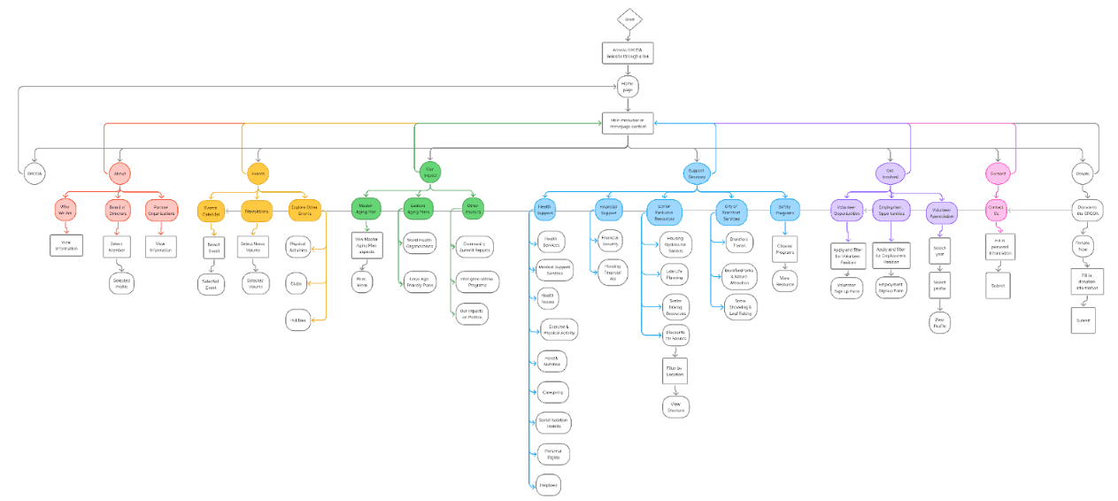
The final solution makes two key decisions. An overhaul of the IA aims at eliminating cognitive load and navigation fatigue by clarifying the separation of active resources and archival information. Additionally, the solution proposes that the GRCOA can bridge the gap between its future users by employing a mobile-first approach rooted in social discovery through platforms such as Instagram and TikTok.
Affinity Mapping:
What I Learned
My personal Takeaways from this project were:
Users may not remain the same throughout the lifecycle of a product or service, as time passes the user experience must be updated to grow with them
There is no "one size fits all" in UX, the experience a website delivers must be tailored to what their specific users require but a truly equitable and accessible product allows users to cater the experience to their needs
Nothing exists within a vacuum, a website can attempt to address all of a user's concerns but sometimes designers need to step away from their confinements to see the bigger systemic influences at play


