Waterloo Service's Playbook
Amidst severly siloed departments and no clear guide on service best practices, the Region of Waterloo is in need of a tool to help facilitate their work.
Project Case Study
The Region of Waterloo
3 months (2026)

The Problem
When the client approached us, they presented a series of problems they were facing within the Resident's Experience department of the region. Through surveys and staff interviews we discovered that:
Fragmentation of departments creates communication silos
Lack of documentation of standards creates inconsistent service delivery
Repetitive and menial tasks take time away from higher stakes work
My Role
I was the sole designer within the team. Some of my duties included:
Translating research insights into design solutions
Using Figma to carry the design from wireframing to high fidelity prototypes
Presenting mockups and design proposals to stakeholders
The Solution
The team proposed a modular dashboard that:
Reduced information discovery time by centralizing staff documents within an internal search engine
Ensures regional consistency in service delivery by housing documentation of standardized guidelines
Facilitated higher inter-departmental communication and collaboration by providing staff contacts, creating guides on initiating effective communication, creating easily referenceable section headings, and collectivizing internal content creation
Introduction
The Region of Waterloo supports services needed across the 7 cities/townships under their jurisdiction but service providers find it increasingly difficult to effectively provide citizen support. This issue is further inflamed by not having any documented best practices or region-wide agreed-upon standards. Some members of staff may not even know all the services that the region offers, making it difficult for them to redirect callers when the need arises. This can lead to increased call times and frustrations from all parties. Finally, the various departments are increasingly siloed, with little communication between them, they often do not fully understand how and where to find support and resources.
The Problems:
Fragmentation of departments creates communication silos
Lack of documentation of standards creates inconsistent service delivery
Repetitive and menial tasks take time away from higher stakes work

My Process
My Role
To tackle these issues, I worked with a team to propose a modular internal toolkit focused on breaking down silos, automating manual tasks, and creating a "single source of truth" for regional staff. As the team's sole designer, I translated actionable research insights into effective design decisions within a Figma prototype, all while reverse engineering the Region of Waterloo's existing digital design system.
The region currently has no existing tools set in place, requiring a 'ground-up' design approach to establish the foundation for their internal digital ecosystem. The project began with surveys, staff interviews and a comparative analysis of other playbooks, which clarified the needs of the client. The solution was determined to need the following features:
standardized guidelines for service creation to ensure regional consistency
a centralized system to retrieve staff documents and reduce information discovery time
a living record of regional services to facilitate accurate citizen assistance and redirection
For early prototyping, 3 screens were focused on:
list of modules
module page
search page
Without an existing framework to build upon, sketching allowed me to rapidly visualize potential information structures. Each small iteration took a new feature into consideration, while attempting to keep the most important information within 2 or fewer clicks and as high on the page as possible. The prototype aims to allow staff to find information they need most often as quickly as possible, while still providing fully detailed and easy-to-use documentation. Information hierarchy became a key driver of the design.
Here are my early sketches developing a layout for these pages:
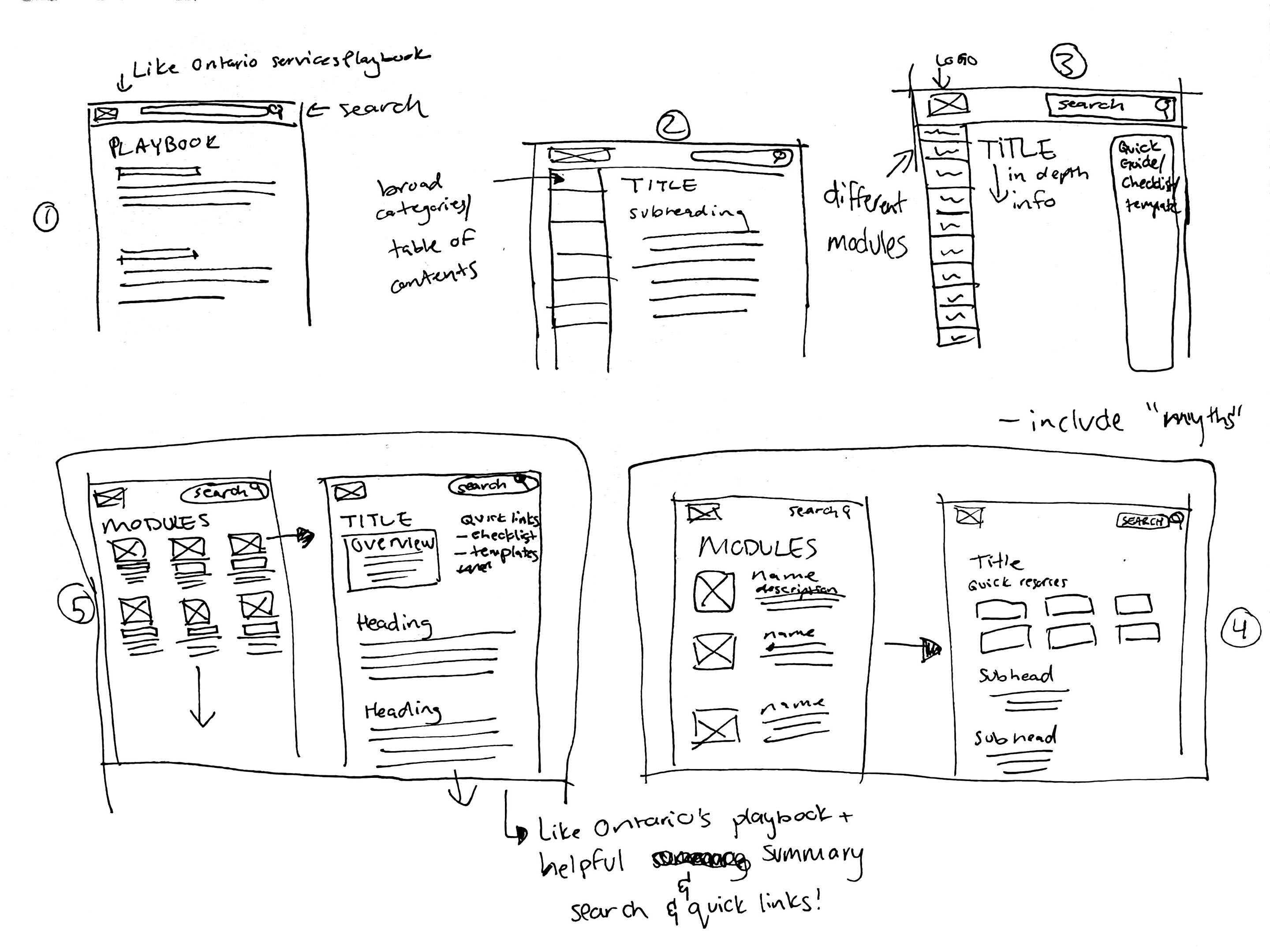
Basic "PDF" style layout of a possible module page
Added a table of contents sidebar to facilitate movement through longer pages
Considerations for potentially including modules on the sidebar instead of a table of contents. This was scrapped as the cognitive load was needlessly increased. The second sidebar for additional links was also scrapped as the section would need to be concise and, therefore, if well-written, should not need its own sidebar. This iteration also muddled the visual hierarchy and was ultimately rejected
From the previous iteration, I started to consider how the collection of modules would be arranged in relation to the actual module page. Modules were presented as cards, but having one per row would cause excessive scrolling if too many new modules were added. Updated module page keeps quick links at the top of the page but greatly overestimates how many links there should be. I decided that only 1-2 buttons should act as quick links to ensure only important and relevant information is present while preventing unnecessary decision-making from the user.
Final sketch before beginning the Figma mockup. Module list now allows user to see more at once, and the module page has a refined overview section before the main body of text. Going into the Figma mockup, I also re-added the table of contents sidebar and created an additional page to visualize the search features.
This led to the following mockup:
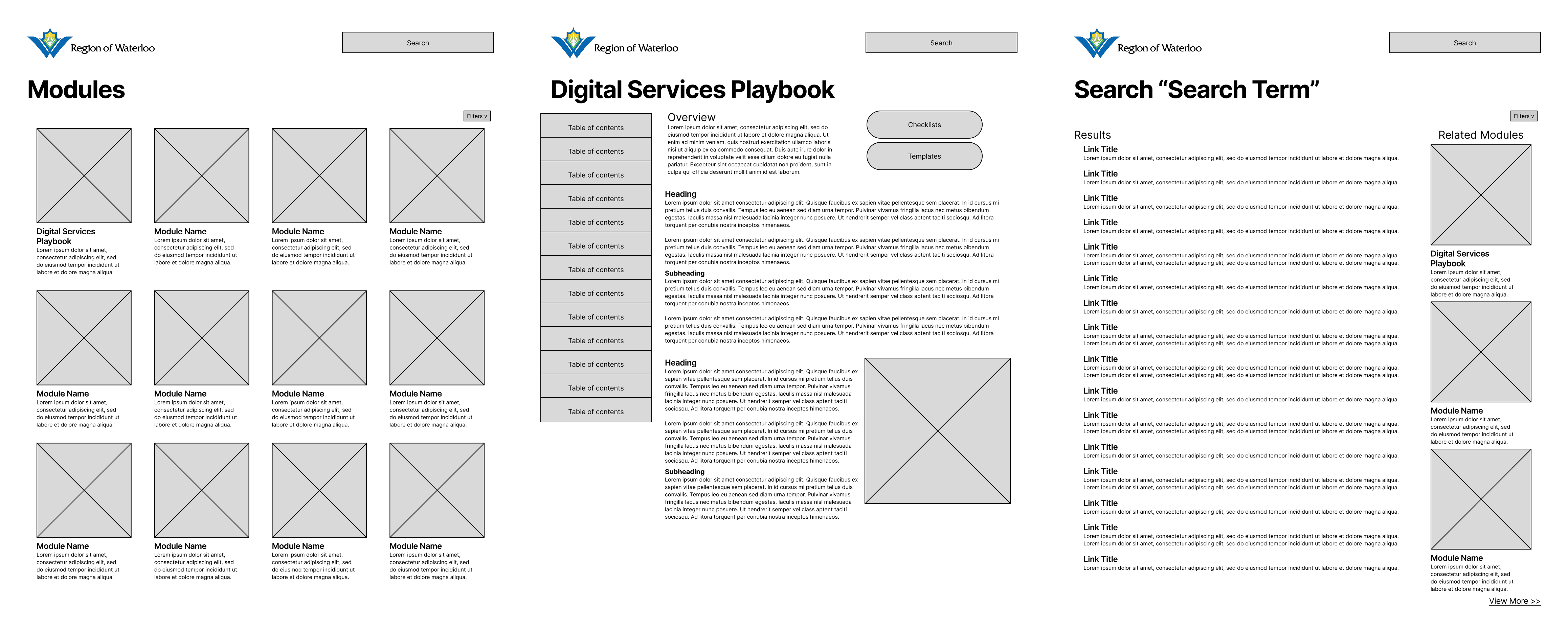
After the first mockup, the team revisited the client for realignment on goals, ensuring we were meeting expectations and creating the tool they actually needed. This meeting led us to discover potential add-ons to our tool that would allow it to integrate within the system of services and tools that the region currently leverages. Throughout the meeting, there was emphasis on creating a tool that can be built upon when needed, a "living document". This was addressed through administrative access to adding modules and editing pages, letting the content evolve alongside the region. The staff also narrated experiences of tedious internal tasks, such as creating lunch forms, that could be made easier through templates. The mention of templates gave rise to the idea of an updated search filtering system that could bring up documents that can be directly downloaded from the search pages. Testing of the initial low-fi revealed that some users did not enjoy the long "PDF"-esque pages and wished that the content be split into multiple pages. When designing the medium fidelity, I created two versions to test which version users responded to the most positively.
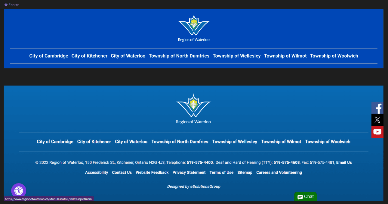
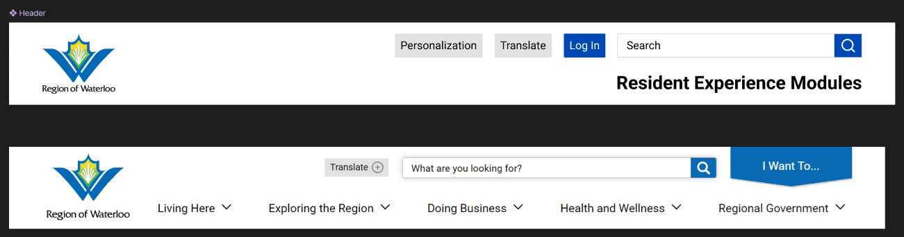
This is also where I began to dissect the design system of the public-facing Region of Waterloo website. I conducted a front-end audit of the website’s HTML and CSS (based on the design system in place at the time) to create consistency in fonts and spacing, making only minor adjustments to enhance legibility based on user feedback. Here are some comparisons of components:
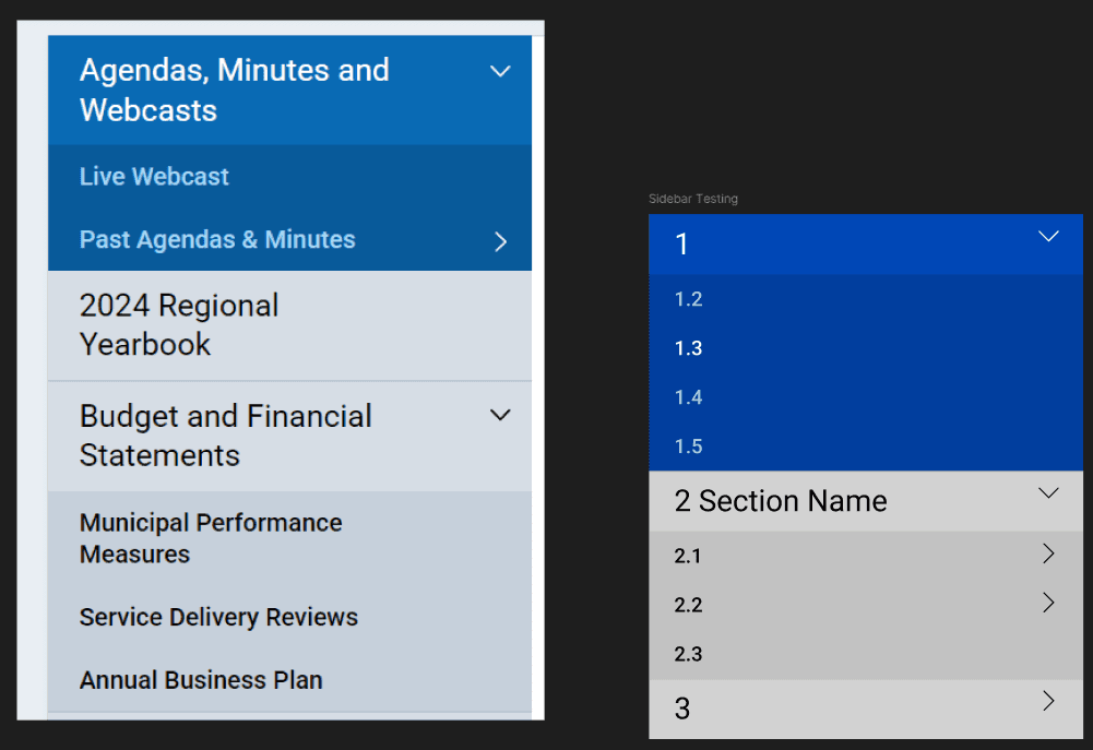
Original to the left, mine on the right
I recreated the table of contents with updated brand colours as provided by the client. I added a numbering system to the sections so that staff can easily create references of content when communicating with each other.
Mine on the top, original on the bottom
The footer was a simplified version of the old footer, focusing on identifying the region's coverage and eliminating components that internal employees likely have no use for.
Mine on the top, original on the bottom
The header follows the same structure as the reference site, but with fewer embellishments, such as the drop shadow. The accessibility overlay from the footer was instead turned into a personalization button to make screenreader and voice control access seamless.
The medium fidelity testing was done with the following screens:
List of modules
Digital services playbook module page (single page and multipage versions were divided into two flows)
Search results page
Research consent form template
Internal staff resources module page
Going back to testing, there was a split in users who preferred the single-page version and the multi-page version. To resolve the split in user preferences, a toggle was added to switch between the endless scroll and paginated screens, allowing users to personalize their experience to best fit their information consumption needs. The client requested to add more of the brand's colours so the button's hover effects were changed from dark blue to yellow. I also created an animation to demonstrate how the search bar would suggest results as users typed their inquiries. Some users had questions about privacy and access to the tool. The final prototype addressed privacy concerns by including an administrative login for editors, while clarifying that the tool would reside securely on the Region’s intranet for general staff access.
Annotated Figma File:
What I Learned
My main takeaways from this project included:
Facilitating consistent client realignment allows a precise fit to user needs and capabilities. This took our static document archive and turned it into a living scalable tool that could better integrate into the region's workflows.
Search tools are still designed as much as any other aspect of the website. Clarifying micro-interactions creates a truly seamless experience whether it's search suggestions or direct downloads, helpimg to reduce friction.
Users can take ownership of their experiences through personalization options. Universal design cannot address all users so allowing users to control the delivery of information to their specific cognitive needs creates more equitable designs.
Legacy design constraints can guide visual design even in the absence of existing digital tool precedence. There may not be internal-facing tools, but the Region of Waterloo still has a design system in place in public-facing digital and print content. This can be used to create visual brand consistency throughout the region's content.
Our testing confirmed that the prototype significantly increased staff confidence in navigating regional resources. Users specifically noted that the template system removed the mental overhead of repetitive tasks, allowing them to focus on high-impact citizen support.
The tool also lays the foundations for higher-level features:
The tool could include a small language model AI powered summary system trained on the internal data of the modules that could directly answer queries, further reducing time required to find what the user needs.
As many of the resources provided are clarifications on region-wide standards for accessibility and privacy. The tool could therefore evolve into an active "proof reader" that scans the work of staff as they type to suggest ways to better align with regional standards.
These improvements give staff the ability to focus on higher level complexities while leaving menial efforts to the AI tool.


